

MOBILE APP
PROJECT OVERVIEW
For my final project I had to ensure I had enough access to proper data and user interviews. I decided to go with my cousin’s behavior therapy practice, Lacosta Therapy, because I knew that with her help I would be able to get all the information and data I would need for this project.
ROLES
USER RESEARCH
INTERACTION DESIGN
BRANDING
UI DESIGN
USER RESEARCH
Due to restriction of the quarantine, I had to get creative with the user interview. In this case the users would be the employees of the company- the therapists. I did a combination of phone interviews, video calls, and chat messenger based interviews.
USER GAINS
• Easy access to Google Docs.
• Accessible mobile and without WiFi.
• Organization of current workflow.
USER PAINS
• Having to print reports.
• Scheduling can get confusing.
• Hate doing math for Gas Mileage expense reports.
• Forget to log hours.
• Hate having to carry around paper receipts.
• Creating expense reports is very time consuming.
COMPETITOR ANALYSIS
Here, I took a more in depth dive into the competitors. I did some research on what the current market had to offer with Practice Management Systems. The biggest companies in that field were Central Reach, AccuPoint, and ClientSource. One of the major similarities between all softwares was how generic they were. The systems did not focus on an


IDEATION - MOSCOW METHOD
After having a clear understanding of the jobs the users would be achieving, I started the ideation process. I organized all the information using the Moscow Method. This gave me a clear definition of the order of importance of features.
MUST
• Personalized schedules
• Daily hour logging
• Reminder to log hours
• Gas mileage calculator
SHOULD
• Customizable text fields
• Information presets
• Receipts scanner
• Offline access
COULD
• Chat messangers
• Personal profiles
• Video conference feature
WON'T
• Client access to app
• Chatroom freedom
• ABA Data collection
USER FLOW - HAPPY PATH
This stage of Information Architect process is the User Flow. Here, I saw the steps the user would take to navigate through the app to perform certain actions. This would be the ideal Happy Path for a user to accomplish the tasks.

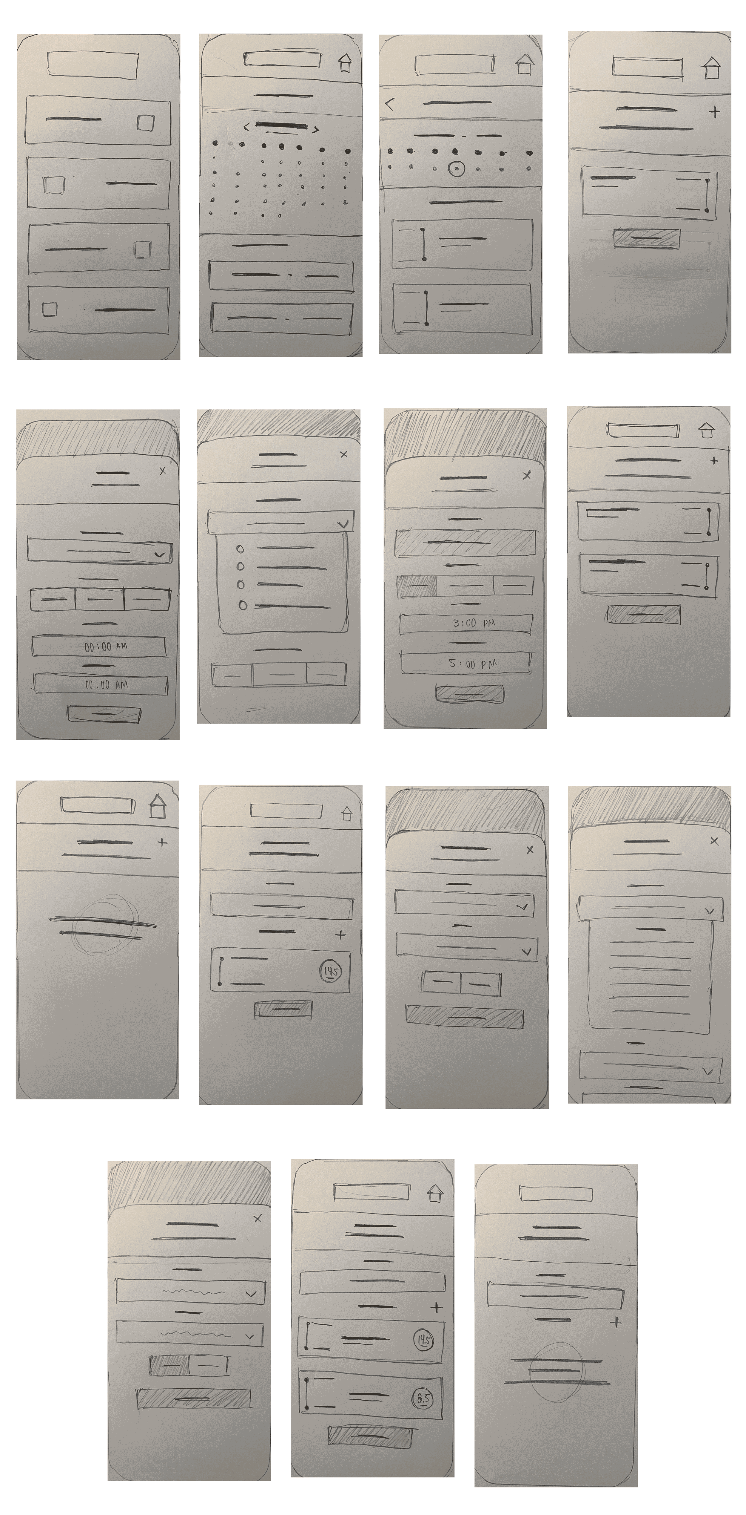
LO-FI WIREFRAMES
I wanted to take a very simple and straight forward approach with the designs, which is something I felt the competition lacked. During a soft testing with the stakeholder and a few users, I noticed only one major issue. The schedule page was very complicated and overwhelmed users with too much information. Instead of simply answering “when do I work” and “where do I work”, it was busy and too complicated.
MID-FI WIREFRAMES
After fixing some of the changes in the Lo Fi sketches I moved on to the Mid Fi stage. I took the schedule page and simplified it with a preview of that day’s schedule. Here I added all the details I needed. I learned from my last project how effective it was to add as much UI details to Mid Fi to make the transition to Hi Fi easy. I continued this practice here choosing fonts, font sizes and areas that will have color and different shades of color.
MOOD BOARD
Here I start to gather images to create the look and feel of my brand for the product. I compiled a group of images that best matched the user persona. I tested this mood board with 6 of the company’s users and the stakeholder and got a 78% match to some of my brand attributes. These brand attributes are: Organized, Helpful, Simple, Structured.

STYLE GUIDE
I came up with the name Remedy Systems. Simply because the software system will remedy all the current workplace woes. I chose to go with the shades of blue because they have been proven to make users feel secure and safe. This system is where they will be inputting personal information about clients they use for work. The brand needs to make users feel secure their information will be protected and at the same time this information can be easily sent to their boss.

HI-FIs
For the final design stage I took colors, fonts, and look and feel and combined it. I wanted to continue the simple and straightforward design. Originally, I had the different brand colors throughout the app headers, as well as the logo font and the primary and only font. After testing the product, I noticed I had almost zero issue with the flow of actions or users finding things. They were not pleased with the visual elements but didn’t know why. I decided to adjust things and pick the primary color you see in the final and use that in all my pages, fonts, and buttons. This immediately gave the app a more professional look and gave the secure feeling users are looking for.
