


MICROSITE
PROJECT OVERVIEW
The client is asking for a microsite with a one year life cycle that will be stored in the main platform archive. I decided to go with a client that deals with something I am passionate about, craft beer. So I chose Grovetoberfest, which is south Florida's largest craft beer festival.
ROLES
USER RESEARCH
INTERACTION DESIGN
BRANDING
UI DESIGN
USER RESEARCH
I conducted 5 in-depth interviews with people who have attended craft beer festivals and are into craft beer, a beer snob if you will. I wanted to make sure they went to an event for the art and love of beer and not simply to get drunk.
USER GAINS
• People love the vast amount of selections
• Like to try new beers they have never heard before
• Meet with new people and talk about the craft and ingredients
USER PAINS
• Vast options can be overwhelming
• Don’t know what breweries will be sampling before the event.
• Breweries run out of beer quickly
• Can’t keep track of beer they sample
COMPETITOR ANALYSIS
Here, I took a more in depth dive into the competitors. The market says the biggest competitors to Grovetoberfest are Sprung, and Brew in the Zoo. An alarming thing I noticed on the website is that almost none have any information on the breweries attending the event or any information on the beer that brewery will be sampling.


IDEATION - MOSCOW METHOD
After having a clear understanding of the jobs the users would be achieving, I started the ideation process. I organized all the information using the Moscow Method. This gave me a clear definition of the order of importance of features.
MUST
• Brewery info.
• Info on sampling beers
• QR code on booth tables
• List of QR codes scanned
SHOULD
• Brewery connections
• Save & go option for beer
• List with details of sampled beers
COULD
• Personalized beer list
• Email listing of beers
• Search bar in Attending list
WON'T
• Alert system for breweries
• Paper based saving system
• Map of Venue
* Personal social media links
USER FLOW - HAPPY PATH
To allow me to see how users will be navigating the website I created a User Flow Happy Path. This is a rather simple one especially the ‘During Event’ tasks since we want users to achieve their task as easy as possible so they return.

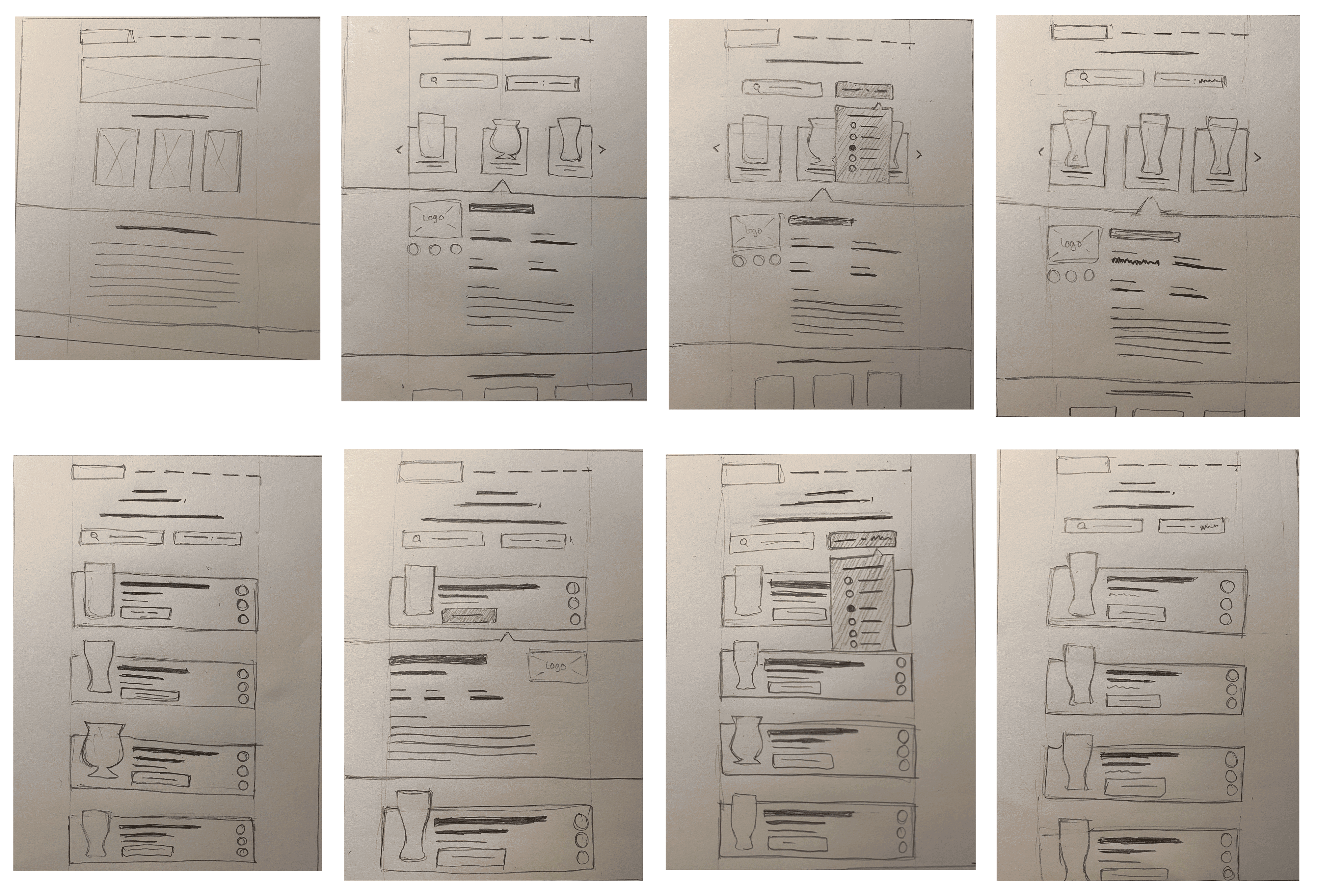
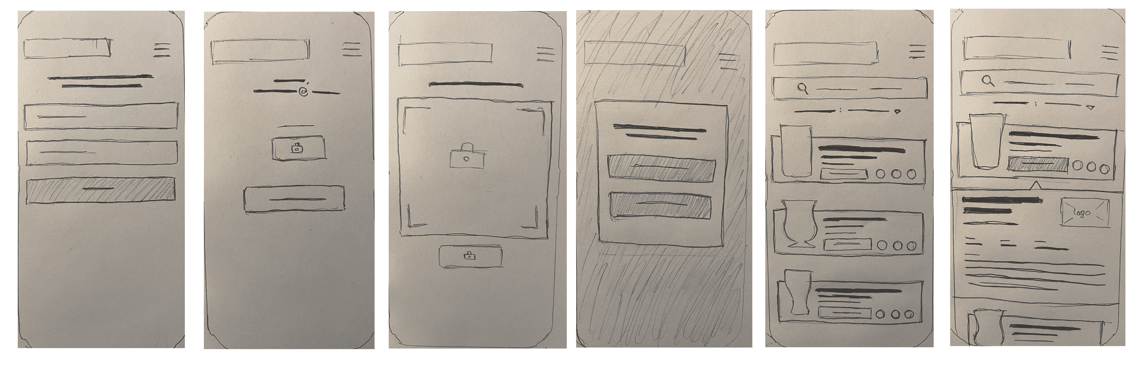
LO-FI WIREFRAMES
When testing the Lo Fi with in person testing and prototyping I noticed one major flaw in the design. Users weren’t willing to spend more than 2-5 minutes going through the carousel of beers looking through to find something they liked. This proved to be a major issue being that the festival has 400 attending Breweries. That will be a lot of scrolling. So since users stated in interviews they usually only go on the website to see if specific breweries were going,
MID-FI WIREFRAMES
After briefly fixing some of the changes in the Lo Fi sketches I moved on to the Mid Fi stage. Here I added all the details I needed. Since for my last project I was a little unprepared to tackle the task of creating an organized design system, this time I was determined to learn from my mistake. In this stage I made everything to the proper sizes it would be in the Hi Fi stage; fonts, spacing, border width, logo sizes, and image sizes were all decided at this stage.

MOOD BOARD
After testing with 8 people, I had them look at the mood board and tell me the first word that came to mind. I was getting a lot of casual, laid back, warm, engaging. One person said it was educational. I asked that person which image gave him that impression. I used that knowledge to re-create a new mood board using that image as my focal point to better match the desired brand attributes my users want.
ATOMIC DESIGN
The atomic design system is truly what allowed me to design all the hi fi screens in such a rapid time period and with so much ease. This has definitely proved to be one my favorite parts of the UI design process. Having started the organization at the Mid Fi stage truly worked out for the best. This let me create buttons and cards before designing the screen as a whole.

HI-FIs
For the Hi Fis I made sure to continue addressing the issues I got in my user feedback. Since I added so much details in the Mid Fi I only had to focus on the rebranding of Grovetoberfest logo, fonts and colors. I kept the sophisticated look, making the focus of content on the actual beers and breweries. I decided to design the during event feature and post event feature in mobile because evidence shows in my user research that users main way of saving down beers they have had is via image taking.

TO VIEW DESKTOP PROTOTYPE CLICK HERE
